Wednesday, March 30, 2011

Ex. 20 Improvement

This was a far more complex project than the last one, stretching my Photoshop skills to the limit and requiring some quality time with Martin Evening and "Adobe Photoshop CS4 for Photographers".  The first and simplest challenge was to select and image that would work well in the context of the exercise:


I originally took this as a candidate for Assignment 3, ultimately rejecting it because the figures in the frame were too dark.  This is a difficult subject to select for lightening as there are very distinct differences in both colour and brightness on the two figures.  I also wanted to maintain the dark shadow at the back of the photo, so could not use a broad levels adjustment to add some fill light to the people.

I turned to Photoshop CS4, can't afford the upgrade at the moment, and started playing with the selection tools. My first ploy was to use the Magic Wand Tool, but I kept getting bleed into the background or too little selection.  I then used the Quick Selection Tool in both add and subtract modes to build a basic selection around the two figures.  At this point I was puzzled how to refine further, but learned that I could further refine the selection in Quick Mask Mode.  I did this using a variety of different brushes and pencil tools to add to the mask and the eraser tool to eliminate any mistakes.

A further step I took was to save the final selection as an Alpha layer, so that I could retrieve it as needed.  The eventual mask looked like this:


The final step was to apply a curves adjustment to the selection and I eventually finished with an image containing two very much brighter people:


They now look as if they are walking in the sun rather than the shade, so a big improvement to the image.  This was a complex technical challenge and a useful skill, although I still think this is an emergency recovery rather than a technique I would choose to deploy purposefully.

Tuesday, March 29, 2011

Assignment 4: First Thoughts

Although I have only just started Project 4, I already have a firm idea about what I want to achieve with the book cover.  A skill that I would like to develop is shooting objects against blue screen and then inserting them into a photograph.  For Assignment 4 I am returning to two childhood interests, Science Fiction and model making, specifically Star Wars.  When the first Star Wars movie was released I was stunned at the effects and still am amazed that this was completed prior to the advent of computer graphics using stop motion photographic techniques.  Every element in the space battles was a model separately photographed against a blue screen background and then mashed together on film.

With this book cover I plan to do a similar but much simpler concept, a single image containing multiple components, built up as layers in Photoshop. I have already completed a mock up of the final comp, although much work remains, the models are badly lit and the angles are not yet correct.

First of all I had to select a background, for which I chose the much photographed Hypovereinsbank HQ.  I have shot it from a distance with a large amount of negative space in the image, open to be filled later in the assignment:


As this is a Sci-Fi image, the blue sky is too "Earth Like", I want a lurid red sky:


This is tropical sunset taken in North Sulawesi, Indonesia during last years vacation.  I have combined the two images in the following way.  I have taken the foreground, processed it to B&W, and then added a strong red tone to create an otherworldly look.  One problem I had was that the includsion of space in the foreground has reduced the perspective in the background, so I have selectively stretched the upper half of the bank  to increase the height of the building.  I have also extended the canvas upwards to create some space for text and other objects:


Next stage was to build and then shoot some models.  I have built 3 Revell snap together, pre-painted kits, a walker and 2 space ships.  So far I have shot two of them:


The removal of the background is still quite rough, again these are not intended to be final images.  The star fighter is the tricky one to isolate as I had to remove the threads from which it was hanging in my light tent.  The clone tool got a work out.  I have also scanned the Star Wars logo form the box, recoloured it and removed the background:


Taking all the pieces and adding them into the photo this is what I have so far:


I have added some smoke and vapor trails.  This is still far from where I want it to be:

  1. The light on the vehicles is wrong, the sun was high when I shot this and shining from the right side of the frame.  I appreciate that I now need to replicate this in the shot.
  2. I kept the star fighter in colour, but processed the walker to balck and white, I think both will stand out better in colour
  3. I need some more practice with the paint brushes when adding effects
  4. The walkers perspective is not quite right yet, although I doubt I will ever get it completely right
I have to be careful not to try to strive for something too "realistic" this is meant to be a comic/pulp fiction book cover, not a work of art.  It needs to look a little fake and over done, that's part of the appeal. 

Finally, whilst I am enjoying this, it is not quite what I think of as photography.  The skills learned will be useful, however, it is not really my gig and is pushing my decision on Level 5 courses towards the two subject based courses, leaving out PWDP.  Incidentally a major reason for doing this course rather than a theoretical course was to build some skills in this area to make PWDP an option rather than a necessity.

Saturday, March 26, 2011

On Truth

Once again I find myself pondering the discussion about photographic truth.  This was triggered by two things, first continued reading of The Cruel Radiance and secondly recent reporting from Japan concerning the ongoing Nuclear crisis.  A great deal of ink has been spilled criticizing documentary photography for purporting to tell the truth through a photograph.  I find even asking the question to be pointless, why even wonder if a sheet of paper covered in a pattern of colour shades can tell any sort of truth.

However, this is not unique to photography, written reporting is just as suspect in its ability to tell part of the  story, to omit key details , or worse still the deliberate misrepresentation of facts.  This is where I turn to the reporting of the Nuclear accident in Japan.  Today the Telegraph led with "Japan crisis: nuclear workers exposed to 10,000 times more radiation than normal"

http://www.telegraph.co.uk/news/worldnews/asia/japan/8406408/Japan-crisis-nuclear-workers-exposed-to-10000-times-more-radiation-than-normal.html

What was not said was what this really meant, 10,000 sounds like a lot, but 10,000 times what?  10,000 times zero is still zero.  10,000 times something very small might be something still very small.  The desire of the newspapers to find and publish big numbers, irrespective of what they mean can be highly misleading and frighten people without an education in Nuclear Physics.  Only reading several reports and researching the affect of exposure can provide the"truth" of this story.

Turning back to photography, a single photo, in the same way as a single news article says nothing.  However, 100's of photo's combined with verbal testament and other forms of evidence can amount to the truth.  Without the video footage of the wave and the countless photos of stranded ships and the utter destruction, the words alone could never have conveyed the horror of what happened.

Surely photographs need to be seen to provide a part of a complete truth standing alongside multiple sources.  Take the photo away and the truth is severely diminished, on its own it says nothing.

Wednesday, March 23, 2011

Ex. 19 Correction

Removing blemishes from photographs is painfully familiar to me from my experience in underwater photography.  No matter how careful you are in position of underwater strobes there is always a chance that they will illuminate the subject, but also particulate matter in the water between camera and subject.  This appears as "snow" in the image and in large enough quantities destroys the image.  Almost all images will contain some of this and subsequently almost all underwater images require a degree of correction.  I perform this in Lightroom using the spot removal brush.

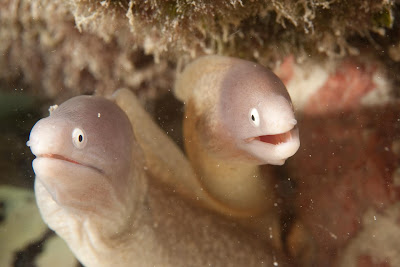
However, there are occasions when the image is very badly affected, but the subject is of sufficient interest that this becomes a major task.  One such image is the following, a pair of white eye morays, rare individually, but very unusual to find tow together.  Compositionally a fine image, but the noise, oh boy!


Clearly an image in much need of improvement, WB, contrast and crop being the start.  The next frame shows the image part way through the process, highlighted are all the dust spots I have removed:


And the final image - major improvement


Thus coming to the image that OCA provided, I was quite familiar with the tools.  The challenge with this image, as with the Eels as well, is what to remove.  In the case of the provided image, there were artifacts that clearly were part of the soaps, I left these alone.  


The other provided image was more of a challenge from a technical perspective, but also from an ethical standpoint.  Unless there really was a very strong business reason to correct this image I would not do so.  I prefer to get this type of issue right in the camera, use of the replay function can quickly reassure that a photograph is badly affected by flare.  Having said that I did the job as a useful learning exercise


My first attempt used the same tool set within Lightroom to clone out the flare.  I essentially built the wall underneath the flare upwards to replace the artifact after using some colour correction to reduce the colour affect.  This process changed the tonal balance of the shot and so is not so useful in all cases


In my second attempt I have used the clone tool in photoshop set to Colour or Darken and slowly chipped away at the polygons until they were gone.  This preserved the structure in the shadow, but was far more time consuming.


In both cases it helped to have a very low resolution image in which detail is difficult to discern.  The change left quite rough edges in places.

Again, I would either accept a flare as part of the photograph or rework the image on location to remove it at the time of shooting - I think this is a step too far.

Friday, March 18, 2011

Thoughts - Completing Project 3

This is one of the segments of my OCA experience that I would happily have extended, I still have much to learn about Black and White as a medium and to my surprise have discovered that I really enjoy working this way.  B&W imagery has liberated my photographs from the challenge of colour management and contrasts, enabling a clearer focus on the formal structure of the image within the frame.  Even if I ultimately do not do much further B&W this exercise in photographing the shape of things rather than the colour of things will inform my image making in any style.

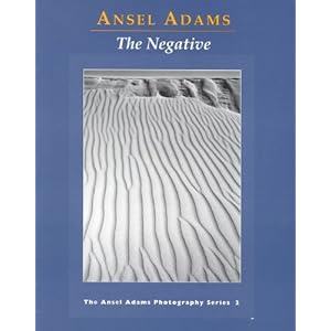
Whilst doing this segment of the course I also had the time to complete my reading of Ansel Adams classic series on photography.

The Negative (New Photo)

The Print (New Photo)

These books continued in much the same vein as the first, "The Camera".  Moving into the chemistry of developing and printing they are not easy to read and much of the information is of limited direct value.  The zone system is interesting as a model, however, not easily understood and I think to some extent obsoleted by the capabilities of modern digital cameras.  What as immensely valuable, however, was the philosophy and approach taken, the emphasis on craft coming before art is particularly important.  I see many fellow students questioning the point of some of the more repetitive exercises in the courses, this is the nature of building skills, repetition and reflection.  Adams continually suggests that photographers go out and take test shots to calibrate film or metering, repetitive tasks designed to build deeper understanding of both equipment and medium. I have to admit I skimmed many of the more chemical discussions, simply glad that I could avoid building a dark room containing a sump drain to wash away dangerous chemicals.  I sometimes romanticize the traditional practice of photography without really adding the context of the time and patience required.

The take away from these books for me is to take more time over each stage in the photographic process from first capturing the image, through the software based development process to the final print.  In particular I plan to spend more time looking at the print process and managing the quality of my output, particularly at larger sizes.

I now move onto the 4th project, "Reality and Intervention", once again with the same troubled thoughts as when I approached B&W,  I have always had to do a degree of correction of images, particularly the removal of sensor dust marks or water born particulate matter reflecting in my underwater strobes.  I also do a little selective dodging and burning, modification of perspective, and application of filters to darken or brighten skies.  I apply these techniques to improve the quality of the image, to better present its tonality, and to correct for lens introduced distortion.  Each is analogous to analogue film processing or camera control.  However, none of the actually changes the content or overall structure of the image.

I do not have a philosophical objection to large scale image change, I just find it rather pointless in the context on my own photographic goals.  Photography for me is the challenge of looking and then using the camera to translate my vision onto something that can be shared with others, hopefully to interest or challenge them.  If a figure needs to be removed, be patient wait for the bugger to move out of the frame.  If an artifact exists go back and shoot again.  Admittedly I confine my photography to my immediate surroundings so it is always possible to return to a place, however, in the case I cannot then the image is binned.

Once we step beyond the basic tools (clearly this boundary will change subjectively and is open to debate) we move from photography into graphic art, a fine and interesting discipline that uses photography as a key tool, but is not in itself photography.  The final element of this project is to design a book cover, something I am looking forward to, however, photography is the production of the base image, the final cover is graphic art and I suspect that in the book publishing world two different departments will handle these tasks.

On a final point of perceived truth, photography does not reflect reality, it simply captures a version of reality in a finite space that existed for the time it took the shutter to open and close.  It is the publisher of the timage who then pretends that this is reality , and the audience who believe this.  An unaltered photograph has not pretense to be reality, what difference if it is altered?  Provided no claim is made for the "truth" of the scene why should we care.

On a final note I am currently reading "The Cruel Radiance:Photography and Political Violence", by Susie Linfield, a book which asks searching questions about how photographs of cruelty and exploitation should be viewed or indeed used as evidence.  I am only a couple of chapters into the book, but it is already providing a fresh view on Sontag and Barthes, postulating that photographs can influence our thinking and that we have not become desensitized to violence through repetitive images.  I will write a more complete review later, however, I mention this book here, because it addresses the issue of photographs as evidence, but also does not accept that they portray reality, rather the reality of the person taking the photograph, not the victim in the photograph.

Wednesday, March 16, 2011

Assignment 3: Submission

Introduction

Continuing with a theme based around the urban landscape and city architecture in this assignment I have conducted a study of a bounded area attempting to describe the space through Black and White photography.  That place is the Hofgarten located just to the North of Munich’s city centre.  The Hofgarten was originally built in 1613 as a formal garden for the enjoyment of the monarchs of Bavaria, adjoining the royal palace; now a rather wonderful garden open to all people.  On the Western edge is the central Munich law court a mix of new and old buildings, fronted by the Munich war memorial and with some parts of the building still scarred with shrapnel from the bombs that fell on the city during the 1940’s. West and North are a series of cloistered walkways containing shops, cafés and a very pleasant place to stroll escaping the heat of the summer.  South is the palace, now a museum, housing a small Egyptian collection as well as the trappings of royalty.

The gardens are used by Munich’s residents for a variety of purposes; simply sitting and watching the world go by, playing Boules in the gravel, drinking at one of the café’s, or like me taking advantage of a marvellous location for taking photographs.  There is always someone taking pictures, from professional wedding photographers using the backdrops for romantic shots of the newly wed to tourists snapping away at Europe’s past and present.  For me it is the blend of old and new architecture coupled with the people occupying the space that continually pulls me back to this location.

The variety of structure and use yield a wide variety of subject matter to exploit in the exploration of a new medium, whilst the finite space provides limits.  The Hofgarten contains strong structural elements and textures well suited to a Black and White treatment, but also people that periodically inhabit these structures.  My goal in this set of 10 images is to describe the space photographically, primarily using shape and form but including a small narrative element.  It is my intent to show what I have learned about the medium of Black and White photography and demonstrate the skills I have so far developed.

Although I have used a variety of techniques and lenses one setting remained constant throughout, I placed the camera in a mode that ensured that all live view or replayed images would be rendered as black and white. Of course the image captured was a 14 bit colour RAW and the in camera B&W image a simple JPG conversion.   Most of the images were made with the camera mounted on a tripod using live view for composition.  The fact that the live view display was thus Black and White greatly helped with the visualization of the photographs. 

I have very deliberately cropped many of the images to improve framing. With Black and White I find that framing has much more influence on the impact of the image than with colour.  I presume that this is because shape and form are so much more important, and a key form in the picture, perhaps the most important, is the frame edge.  All processing is using  Adobe Lightroom 3.

Finally I am including a screen grab from Google Earth showing the approximate location and orientation of the camera for each of the shots in the submission. 


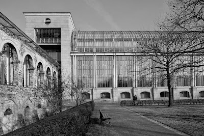
DPP3-1: “Old and New”

Canon EOS 5D2, 24mm TS-E 
1/125s, f/11, ISO 100 
Crop: Original (3 x 2) 


Composition: My first photograph is a wide angle shot intended to provide a sense of the western border of the Hofgarten.  I have framed this rather formal study to present a contrast between the new and old buildings in the park area.  The people in the background add some scale, but I would rather they were not there; however, there was no interval without somebody in the frame.  I could remove them digitally, but am avoiding this level of intervention in the picture at present.

Processing: I took care to ensure correct exposure, so no exposure compensation needed.  I have increased contrast and accepted that some shadows are fully black.  In the B&W conversion I have darkened the Orange channel to bring out the brick texture on the left and increased the Yellow channel to brighten the grass and vegetation in the foreground.  I have not adjusted the Blue channel as I was comfortable with the sky tones.

DPP3-2: “Shadows”

Canon EOS 5D2, 24mm TS-E
1/180s, f/16, ISO 100
Crop: Freehand (1.76 x 1)


Composition: Moving to the centre of the court house and to the far right of the shooting position for the first photograph this is another wide angle shot intended to provide a sense of the place and the people within it.  I was intrigued by the shadows of the flag poles behind me leading into the frame.  I have deliberately chosen a strong perspective emphasizing the length of the building and the lines formed by the steps and elongated building. 

Processing: With this photograph the key decision was how to crop the image.  When I took the photograph there was no possibility to include the top of the court house without making the people in the frame too small and losing the strong horizontal perspective.  I have thus cropped even tighter to emphasize the horizontal structure in the photograph.  This does leave the building cut off, hopefully this adds some tension, or maybe it is distracting.  The low sun created strong contrast so little adjustment was needed.  In the B&W conversion I have slightly lowered the Orange channel to add texture to the stone.  I have greatly lowered the Blue channel, to darken the sky and create contrast with the brightly reflecting steel and glass.

DPP3-3: “Watching You"

Canon EOS 5D2, 70-200mm f/4
200mm, 1/250s, f/11, ISO 100

Crop: Square


Composition: One of the qualities of B&W I wanted to explore was structure and the careful capture of details in the court house.  I shot this just as the Sun was passing around the building, noticing the shadow of the surveillance camera. 

Processing: This photograph called for a Square crop, eliminating any unnecessary detail from the frame.  I suspect my liking for Square or 8x10 crops in B&W may reflect the heritage of medium format images I have been studying in my reading plan.  I have pushed the contrast up by increasing the Blacks slider and the Contrast/Clarity.  Colour wise I have pushed the Orange channel a little to lighten the stone.

DPP3-4: “Our Fallen”
Canon EOS 5D2, 24mm TS-E
1/90s, f/16, ISO 100

Crop: Freehand (1.78 x 1)


Composition: This is the Munich memorial to Germanys war dead, “Unseren Gefallenen” – Our fallen, a massive slab of stone covering a recessed space in which lies the statue of a dead soldier.  With this photograph I wanted to convey the solemnity of the subject, with a very simple and direct composition.  Black and White proved ideal for this subject.  I could not frame to lose the trees, but in retrospect (as Clive pointed out), the stains on the stone seem to merge the trees into the monument. 

Processing: This was a very difficult image to frame and camera positioning was crucial, trying to get the focal plane parallel to the subject.  I was still slightly out and it required significant work with perspective adjustments to bring the image parallel.  The strong shape immediately reveals any misalignment.  I have strongly increased the Blacks to render the space under the slab completely black to add to the presence of the image.  There is one flash of light that one could argue might be cloned out.

DPP3-5: “Arches”
Canon EOS 5D2, 24mm TS-E
1/15s, f/22, ISO 100

Crop: 8 x 10


Composition: Returning again to a theme of repetition this image shows the light and shadow created within the cloisters bounding the Hofgarten’s northern side. A couple walk in the vanishing point, would like them to have been larger, but everyone very politely moved out of my line of sight when using the camera. 

Processing: In cropping this photo to 8x10 I have eliminated an area of blown out highlights on the left of the image that resulted in underexposure elsewhere.  I have thus increased the exposure by nearly 1eV and added in fill/recovery to relieve some remaining detail loss.  In the B&W conversion I have pulled the Blue channel down to darken the shadows and remove some of the glare.  I have selectively brightened the figures in the background.

DPP3-6: “Tree”
Canon EOS 5D2, 70-200mm f/4


180mm, 1/500s, f/4, ISO 100


Crop: 8 x 10


Composition: Within the gardens making up the Hofgarten are a number of very carefully shaped trees, which in absence of foliage reveal the twisted internal structure of the branches.  I have chosen a very simple framing, using a wide aperture to separate the tree from the background.  I chose a tree that had a relatively simple background formed by trees rather than buildings. 

Processing: This is the most heavily processed image in the set.  After cropping to 8x10, I have added a vignette to further emphasize the round shape of the tree.  I have adjusted the tone curve to darken the background, but it is in the B&W conversion where the biggest adjustments were made.  I have pulled the Blue, Aqua and Purple channels very low to darken the background whilst increasing the Yellow and Orange to brighten the sunlit tree.  I also considered duo toning this image, but early on elected to stick to pure B&W for this set of images.

DPP3-7: “Finally some Sun”

Canon EOS 5D2, 70-200mm f/4
135mm, 1/2000s, f/5.6, ISO 400
Crop: As Shot (3 x 2)


Composition: I visited the Hofgarten several times for this set, but on this day the sun was shining for the first time in a long while; this composition seemed to capture the essence of enjoying the winter sun.  It also captures the strong structure of one of the many different walkways in the Hofgarten. This was something of a grab shot and using a longish lens with no stabilization I had dialled in very safe exposure settings, I think this could have used a little more depth of field. 

Processing: Once again the low Sun has delivered strong contrast, so only limited adjustments needed.  In the conversion I have used the default plus a lowering of the Orange channel to darken the brick work.  This caused a problem by darkening the ladies face too much.  I fixed this by painting on a small mask and increasing the exposure to lighten her skin once more.

DPP3-8: “Perched”
Canon EOS 5D2, 70-300mm f/4-5.6L
300mm, 1/180s, f/11, ISO 100

Crop: Square


Composition: Taken with a Tripod I framed this with a square crop in mind as I shot.  I have used a narrow aperture to retain some detail in the background, but enough blur to create a sense of depth.  I have positioned the reader at the junction of the top and right thirds.  I produced a number of geometric studies, this is the only one with a person in i. She adds some context to the image, illustrating another use of the space. 

Processing: The strong reflection from the stone caused underexposure of the shadows and required a jump in exposure of 0.78eV and some fill light to provide detail in the clothing of the seated figure. The colour conversion saw reduction in the red channel to darken the roof line in the top left of the image, and an increase in the Blue channel to lighten the background.


DPP3-9: Perambulating
Canon EOS 5D2, 70-300mm f/4-5.6L
200mm, 1/180s, f/4.5, ISO 200
Crop: As Shot (3 x 2)


Composition: The Hofgarten is surrounded on all sides by tree lined avenues, popular for talking a Sunday walk.  On this day the damp ground was steaming a little in the sun, creating a hazy effect in the air.  I took many similar photographs varying position, focal length, and the inclusion of the people.  In this one I placed my camera on a tripod and waited until the people heading in each direction were roughly adjacent and so in focus. 

Processing: This was difficult to process; small adjustments to contrast could wipe out the detail in the trees above the walking figures.  I have opted with a 0.5eV increase in exposure and small increase in Blacks.  The B&W conversion was more aggressive, with substantial lowering of the Blue and Aqua channels to add contrast in the background.  This was a tough image to decide upon the way I wanted it to be.

DPP3-10 Throw the Damn Ball

Canon EOS 5D2, 70-300mm f/4-5.6L
300mm, 1/180s, f/5.6, ISO 400
Crop: As Shot (3 x 2)


Composition: A grab shot and unashamedly sentimental photograph, but very much in keeping with the area and its use.  The dog was simply fed up, watching his owner playing Boules, but not throwing his ball anywhere.  The composition includes many aspects of the Hofgarten, bicycles piled up near a covered fountain, with a blurry figure in the background enjoying the spring air. 

Processing: Due to the very quick shot this was a messy image, needing rotation and cropping to bring the composition to a balanced structure.  The higher ISO also needed some noise reduction and more sharpening than usual.  This has created a rather grained look, however this seems acceptable in Black and White.  I have pushed the Orange and Yellow channels up to brighten the foreground, especially the dog, whilst reducing the Blue channel to remove some strong specular reflections on the Bike.

Monday, March 7, 2011

Ex. 18 Colours into tones - 2

Wanting to experiment more, I have completed this exercise with each of the three target images, all taken from my library.  The first 4 images are from a holiday a year ago close to the equator in Indonesia.  These scenes possess good attributes for the exercise in hand as they are hazy due to the humidity or possess very bright green foliage.

The subject is a dive boat heading for home at the end of the day.  The standard conversion is ok, but very flat.


To enhance the haziness I have reduced the clarity slider, which reduces the sharpness of the image, and then significantly lightened the Blue and Aqua channels. as can be seen in the Lightroom toolbar below.  the image is much softer, the background almost looks as if rain is falling.


My second image, also captures the tropical evening, and again the standard conversion is quite satisfactory, but fairly high in contrast:


Once again I have reduced the clarity slider, although less this time.  I also had to be careful with the colour conversion, as moving the Aqua slider too much had a very negative affect on the foreground sea.  However, this conversion really conveys a sense of mistiness in and around the volcano.


Turning to greens, the tropical colours are quite amenable to brightening.  This photograph is of a coconut palm plantation in north sulawesi.  The shot was taken from a moving car, but the day was exceptionally bright:


In the initial conversion the green grass and leaves are dark relative to the sky.  By lightening the greens and dropping the blues I have reversed the toning almost creating a negative or even IR style image.   With this conversion I had to take care to also increase the yellows as the palm trees had a significant yellow component


Selecting a more difficult image the next photograph is of an island surrounded by a lagoon.  In this case there is a significant green element to the ocean:


Once again I have darkened the sky, but in this case that has also darkened the sea, balancing the lightening of the green channel.


My final image is a portrait.  The background is a bookcase and has some tones quite close to skin, meaning that I had to be very careful with the conversion.


in this case the conversion has resulted in far too dark tonality on the face, something I have corrected by carefully lowering the Yellow and Orange channel.


Overall, another very useful exercise, the power of these tools to alter the mood of a photograph is remarkable, this cannot be done so easily in colour, and does demonstrate that B&W as a medium offers quite a lot to an artist willing to experiment.