Friday, April 22, 2011

Assignment 5: First Thoughts

Now that Assignment 4 is on its way to my tutor, I turn my thoughts towards the final assignment.  The Assignment offers complete freedom of subject simply specifying a personal project.  I am not entirely happy with this, I prefer a closed rather than open task, however it is what it is!

A successful submission needs to demonstrate two things:
  1. That I can apply all that I have learned from the course
  2. Artistic development
For the former I need to produce a set of images that reflect good workflow, combination of colour and monochrome, and a judicious use of manipulation to improve quality and perhaps message.  For the latter I need to demonstrate (to myself especially) that my skill in developing a concept and delivering entertaining or challenging work has made a step forward.

To date my focus in the course has been the development of skills in portraying the urban environment, primarily from a landscape ethos.  I have consciously taken this route as I expect my next step to be the Landscape Level 5 course.  I am using this course to develop skills that will be useful later on.  With this in mind two subjects present themselves as possibilities for this assignment:
  1. The Legacy of the Olympics: Munich hosted the 1972 Olypmpics, famous for Mark Spitz and infamous for the terrorist attack on the Israeli athletes.  However, the facilities created 40 years ago are still in constant use and are a much loved part of Munich's landscape.  A photographic study of the arenas and housing would make for an interesting and challenging assignment that aligns well to the upcoming London event.  I just hope London is able to enjoy its legacy as much as Munich
  2. Shadows of Evil: Munich is a very beautiful city with a very liberally minded population.  This was once very different, in the 1930's the city was the origin of the greatest evil yet to plague the Human race.  All over the city there are reminders of this past and its affect on the city, from the monuments of the Nazis to the mountains of rubble from bombed out buildings, you cannot escape from the negative legacy of Hitler and hist party.  The challenge in such a study would be to present a coherent and meaningful set of images, many of the places once frequented by the Nazi party are now erased.  However, the city still has shrapnel holes in buildings, ugly Ack Ack towers, and strangely just around the corner from where I live is the house that Hitler bought for Eva Braun to live in!
Both of these concepts interest me very much, I have already worked up some ideas for the Olympics as part of People and Place


Both of these ideas are high on my list of future projects and would work well in the Landscape or Social Documentary courses respectively.

An alternate and one I am strongly drawn to would be to return to Underwater Photography.  When I first set out with the OCA my goal was first and foremost to improve my compositional skills when shooting whilst Scuba diving.  This is most likely the last opportunity for me to see how my skills have improved in the context of the courses, Underwater Imagery might work as Landscape, but Social Documentary of Shrimps is not likely to fly.  

In two weeks time I leave for a two week diving vacation in Northern Borneo, expressly to take photographs.  We will be diving the Sulu Sea between Borneo and the Philippines, an area renowned for Macro subjects, but also offering some wide angle potential, especially some of the larger sharks, such as Leopard and if very lucky Whale.  At the end of my Art of Photography course I used a similar diving trip as a narrative, this time the goal would be much more towards the fine art side.

http://sclarke-blog.blogspot.com/2010/06/assignment-5.html

I will in any case publish a Blurb book to document the trip, this time I am intending to produce something more in the David Doubilet line than my usual photo narrative.

I am very serious about underwater photography, although this is now not so much an obsession as it has been joined by any number of other photographic quirks.  My kit consists of two Canon EOS 40D 10MP APS-C sensore cameras, a 60mm Marco, and 10-22mm zoom.  I can also use a 100mm macro, but I find this is too long when used with a crop sensor camera and have the option of using my 17-40mm zoom (good shark lens).  All of this is housed in an Ikelite Acrylic housing with flat port for Macro, Dome port for Wide angle, and a pair of TTL 125J Strobes.  This is me with my kit annoying a pair of lion fish


I feel this would be a better test of my progress and a return to my photographic roots, the risk is that Underwater Images are not always viewed as art.  Then again, making them into art might be the challenge.  I have never processed into Black and White and also much of the colour management in this course could be applied very nicely to the often irritating colour castes in underwater images.  As a parting shot here are a few of my own favorite underwater images.  Question is, can I do better?  I am sure I can!


Singapore

A couple of weeks ago I had the good fortune to have an excuse to spend a long weekend in Singapore, one of my favorite cities.  My wife was there on a business trip and I had enough Lufthansa miles for a very low cost fare, so 4 full days in Singapore for little more than 300 pounds, jumped at the chance.  I did spend a day in HP's Singapore office as I also had some people I could usefully meet, however, my primary goal was to have 3 or 4 days free with my camera to explore the city and try to capture something of its' essence.

I was also giving my new Samsung NX100 mirrorless compact camera a good try out.  Although I love my DSLR's and lens collection, the weight and bulk can be a challenge especially when traveling.  As a result I have been looking for something lighter and smaller, but offering the versatility of an interchangeable camera system.  A Leica is out of the question for any number of reasons.  The Samsung appealed as it sports an APS-C sensor and there are a couple of really nice pancake lenses available for the system, a 20mm (30mm FFE) f/2.8 and 30mm (45mm FFE) f/2.0, both fast and very sharp.  To this I have added a 50-200mm zoom and an EVF so that I can avoid framing using the display screen in extreme light (i.e. Singapore).  Together with a flash, battery charger, spare batteries, POL filter, and a few other bits and pieces this fits in a camera bag which would just about hold my Canon 5D2 and single lens.  To cap it all my wife bought me the body, kit lens, 30mm lens, and flash as an anniversary present.

The only downside of the system at present is the rather limited lens selection especially at the extreme wide end, however Samsung will shortly release a 16mm (24mm FFE) f/2.5 pancake which will nicely round out my kit.  With the prime lenses the quality is very good, and the sensor can handle ISO to about 800 before noise becomes a real issue.  I also get the impression that Samsung plans to be a major player in the mid-range market, leaving the DLSR's to Canon/Nikon, but seriously competing with Sony, Olympus and Panasonic in the EVIL technology space.  I suspect they will do rather well and it will be good to have competition for the usual suspects.

This was my kit for Singapore...

I planned to simply wander the streets and see where my muse took me, no goals, no assignment, just me and my camera - be a flaneur for the day.  This, however, might have been great in Paris, but in the tropical heat (+30 in the shade) I rapidly wilted and my ambition had to be curtailed.   Photographing early in the morning was not really an option, jet lag saw to that and I also wanted to have some fun, not simply exchange work at my computer for work with a camera.  Evenings proved very fruitful, however, the sun moves quickly on the equator so I had to work fast.  Landscape was also limiting, the air is so wet that haze obscures much of the distance, a useful feature in some situations, but I can see why Hong Kong is more popular for city scape photographers.

After the weekend I did not leave with a unifying theme, rather a series of images that coalesced around a number of ideas:

  1. Architecture - I cannot resist it and am finding this might be my genre
  2. Old and new - Singapore is constantly being rebuilt, often with little regard for history
  3. Night Life
  4. Interiors
  5. Street Life
I still found myself nervous about shooting "Street", although the discreet little NX100 really helped not to draw attention to myself.

Starting with architecture here are the best of what I shot:


These two are pretty conventional high rise shots, but I am still very pleased with the abilities of a simple camera to take such clean shots (both use the 20mm)


This was taken from the top floor of a skyscraper hotel and shows the Singapore theater complex, looking like the eyes of a giant bug with the new Sands Hotel, Leisure and Shopping complex behind.  The challenge with this shot was to manage the reflections in the window and to frame in an interesting manner, I hope I succeeded.


The final two shots are taken at the base of the Sands hotel development, a very strange architecture, but offering interesting juxtapositions to the city.

Moving onto Old and New, Singapore offers quite dramatic juxtapositions of traditional Chinese buildings with  the Glass and Steel of the financial district.  As I walked around I felt a sense of the destruction of the old by the new, in particular it felt sad that the banking system that has caused so much pain in the world recently still has the arrogance to crush history to make more money.


Of these the second seems very sad to me, this traditional shop house appears about to be eaten up by the emotionless buildings behind it.

However, Singapore is a vibrant city that comes alive at night, a vibrancy that is fueled by the money pulled in by these buildings.  The ultimate contradiction is that the charm that makes Singapore is effectively destroying itself.  The following photos really reflect the colour of the area around Clarke Quay and also demonstrate that the NX100 can handle low light and colour pretty well, all photos are hand held.


I also took some twilight landscapes of the river area, somewhat more conventional:


Shooting in the evening once the sun went down was a pleasure, doubly so as there was always a bar with ice cold Tiger beer nearby, although a second mortgage would be needed to get a skinful.  during the day I was increasingly driven inside by the heat, but then again, Singapore is an inside out city, much of the colour and structure is indoors and even deep underground as people only spend any time outdoors at night.

The first two shots are of two very different shopping centers, the first is Funan, 6 floors of computer and camera shops, very tempting but also fun to photograph:


The second shot is the Sands complex, very high end shops and really insane architecture.  It feels like being inside the metal skin of a Zeppelin.  Another obsession of mine, other than buying lenses, is photographing underground railway systems, these two images are taken at the Dhoby Ghaut interchange:


I did get reprimanded taking the second of these, I still find it odd that officialdom is scared of people photographing railway stations, especially in the age of the 8MP camera phone.  The people they need to worry about are not likely those who take images very ostentatiously!

My final selection of shots is themed around street life, the original objective for all of the images, but one that I had to curtail due to heat and an ongoing nervousness about shooting people without their permission.  I start with a couple of shots taken in the canyons of the financial district


I particularly like the first photo, with its splash of colour and the foreground presence of an office worker passing by.  I also spent some time in the backstreets of China Town, trying to capture the "real" Singapore, whatever that is, but also creating some juxtapositions and layered images:


I also captured a few odd shots:


Finally I have three photographs that don't really fit into any of these themes, firstly a football game


And to think that I was struggling to take photographs, these guys must have been melting.  


This is a favorite building very colourful, the Porsch passing by just adds to the colour and wealth that is Singapore.

My parting shot was taken out my hotel window after nightfall using a tripod and long exposure.  They never stop building in Singapore, night and day there is activity.


This was a good visit, but not as productive as I would have wished, however, I enjoyed taking the photographs and learned a lot.  This was the first time that I thought about a short trip such as this as an assignment and worked hard to produce a variety of images that capture the spirit of the city.  I hope I succeeded.

Assignment 4: Submission

This was a very challenging assignment and far more difficult than I expected, not simply from the skills perspective, but also in terms of thematic design and philosophy.  My initial focus was very much on the “Book 
Cover”; I did not read the brief carefully enough and failed to take in the following sentence:

"The purpose of this assignment is for you to demonstrate this stance, and the means involve completing a project which lies in the middle ground of the real versus fake argument.”

Subsequently I started to develop an “Alien Invasion” concept that used Blue Screen techniques to add Star Wars models into a local landscape.  I spent many hours working on the blend, lighting angles, perspective management, replacing the sky with a tropical sunset and applying split toning to the landscape scene to create an otherworldly affect.  The result was very much valued by the local kids who now have it as a poster for their bed rooms.  The rather weak Photoshop pun in Clone Attack is intentional!


However, whilst I was very pleased with the final result, carefully re-reading the brief led to the realization that this was very far to the right of the Real versus Fake curve. On the other hand I had much fun building plastic kits for the first time in years and developed a number of Photoshop skills that would be useful in what I am going to submit for Assignment 4.  I have included it here as it is a key part of my development in building this assignment.

2 weeks ago I spent a long weekend in Singapore, part Business, part Photography vacation.  In addition to my usual bag full of photography books, I took a copy of 1984, rereading it for the first time since my schooldays.  The contrast between the bleak landscape of “Airforce 1” and the madly coloured retail driven prospect of Singapore provided the inspiration for this submission.   Could I take a retail temple and transform it into the “Ministry of Truth” as a cover for 1984.  On this trip I was carrying a new mirrorless compact camera, a Samsung NX100 and a small range of lenses.  After working with my Canon SLR and L series lenses this “rangefinder” styled and sized camera was a liberation, enabling me to carry a versatile and capable camera kit pretty much everywhere.  The goal for my trip to Singapore was to attempt to document the city, in the end the 33 degree heat drove me inside and I spent quite some time documenting air conditioned space.

One of those images is the following:


20mm, f/4, 1/30s, ISO 100

This is the interior of the brand new Marina Bay Sands Hotel, Casino and Shopping complex, an almost insanely opulent environment.  Somehow the last thing Singapore needed was more shops, but that seems to be the direction their economy is taking.  In any case I decided that this would be a great candidate image for a 1984 themed composition.  It is complex, but offers several planes, the steel work and exposed concrete has a 1930’s sci-fi look to it and is ideal for my purposes.
 
I did not have a tripod and so could not ideally frame the image, this is pretty much how it came out of the camera, with just simple colour and contrast adjustments.  I would like to have applied some perspective adjustment and also to crop a little, however, this was not possible due to my processing strategy - at the time I took around 8 similar shots with different constellations of people, understanding that I would need to clone out some elements and clone in others. I processed all 8 images in Lightroom to B&W with no other adjustments, selected the best starting point (above) and headed to Photoshop.

My processing goal would be to remove any indication of the shopping centres retail function and replace it with elements from the book, namely the slogans:
“War is Peace”
“Freedom is Slavery”
“Ignorance is Strength”

And most importantly; “Big Brother”.  The image of Big Brother presented in the book of an iron hard man with massive moustache and eyes that follow you, is clearly based upon Stalin, so I turned to the web and found the following Soviet poster.  The graininess and aspect ratio were ideal for my intended use.


The next step was the gradual transformation of the shopping centre:

  • First I decided to work in B&W, this suited the subject well, but also made the processing steps simpler as colour balance would not be an issue
  • I cleaned up the interior of the centre, removing some lighting fixtures where I wanted to place slogans, covering up commercial signage, and removing any people from the ground floor where I wanted to add the book title
  • I have retained the rather bright lighting, 1984 is dark, however, subverting an open space is as much an element of Ingsoc as the dark spaces
  • I mapped Stalin to as many plane surfaces as I could.  In doing so I had to consider a number of processing challenges:
    • Each Stalin was added as a separate layer in the image
    • The image would need to be in perspective, for this I used the Distort tool to warp the images to align with wall and floor edges
    • In most cases I changed the transparency of the image to allow some of the interior light to come through.  This varied the surface texture and blended the images better
    • I adjusted the darkness of the images, depending upon where they were in the composition; the light is coming from top left.
    • I also used masking and erasure to make sure that people, banisters, staircases, and other detail was correctly positioned in front of or behind the images
    • The large Stalin at image centre was specifically processed with transparency to look like a back lit canvas allowing the structure of the building to show through
  • The slogans were added using various text tools to merge them into the building.  I have used transparency to retain some shadowing and reflections, especially on the 1984.  For the stronger perspective elements I rasterized the text to have more freedom in manipulating the position.
  • I then added people back into the image cloned from the other photographs in the sequence, In particular I wanted some people on the escalator.  Although very small in the image the 3 men in dark suits on the left hand escalator are important to the composition, I think of them as the Thought Police, particularly the one at the top of the stairs.
  • The final processing step was to flatten the layers and export as a TIFF to re-import into Lightroom for a little finishing.
    • I considered adding grain, but after a few changes to the contrast and brightness, the image was already looking grainy enough – However, it does need to look a little rough, too clean and the effect would be diminished
    • I added a very small amount of Blue into the image using Split toning.  Without this I felt the image was too flat, the Blue provided better visual contrast and oddly (to me at least), makes the image look more Black and White than the simple grey scaled version.

What I have attempted to do with this image is to dress a film set electronically.  Clearly this is not Real, however, is it a photograph of a film set in which people have added imagery to the walls or has it been done via Photoshop.  A close look will reveal that the latter is true, but I hope this needs some thought to figure out.


Ethically, I do not think there is much at issue here, a book cover may always be somewhat manipulated, the image decorating a fiction title is in itself a fiction, however, it needs to be a convincing one.  The closer to photorealism that can be achieved the better the message.

The experience of creating such an image had many parallels with creating a more conventional work of art on paper, a key question was when to stop.  There are still many plane surfaces in the image and fewer people than I am happy with, however, I found that adding beyond the point above, started to overly confuse the image.

Given more time I would make the following improvements:

  • Return and shoot the image at night time, enabling me to darken the roof – I could try this in Photoshop, but it would take a lot of time and I doubt it would be convincing, as I would need to darken each panel selectively, keeping the steel bright as it would reflect the interior light.
  • Achieve a slightly better framing, this is nearly centred, but not quite.  To do so I would mount the camera on a tripod and very carefully line up the symmetries in the image. One of the blends at the top left is mis-aligned as the camera position shifted a little and I could not achieve perfect alignment.
  • Use a better camera-lens combination, although I admit I am surprised by the capability of this little kit.
  • With the camera on a tripod shoot many more frames with people in – I would ideally like to have far more people in shot  representing the teeming masses of the down trodden (Ideally all similarly dressed and looking oppressed, but that would be too much to ask for – unless I was Gregory Crewdson or Jeff Wall)
  • Improve the look of the text, I really struggled to get the alignment and shape right, in places it does not work as well as I would wish.

My final comment is that the “Ministry of Truth” would love Photoshop!

Wednesday, April 20, 2011

Assignment 3: Tutor Feedback

Feedback was overall very good for this assignment, none of my tutors comments really make me wish to change any of the images.  There are comments about framing and some clean up via cloning, however, I am reluctant to go down the cloning route unless it is absolutely necessary to salvage an image.  My personal view at present is still to try and get it right in the camera and then accept a certain degree of imperfection as part of the quality of the photograph.  Cropping I have no issue with, some viewpoints cannot be easily achieved with a given focal length and access constraint.

The weakest image was the study of a tree, I agree, that this was very static, however, from a development of processing skills standpoint this was one of the most complex and involved pieces of work. 

The strongest images were the ones with people and interaction, Parambulating and "Throw the Damn Ball" had good feedback.  Although I am still very much in the mind of developing towards an urban landscape theme in my work, urban must include and involve people.  This provides scale and most importnatly context to many otherwise rather sterile architectural compositions.

The one comment I am less sure about was the advice to crop the trees from the top of the image, "Our Fallen".  I did consider and reject this, but only after seeking advice via the Flickr forum.  Interestingly it was a tutor who advised me to retain the trees, as they added life from death and the streaks on the front of the slab echoed the structure of the trees.  This raises an interesting question in my mind, both tutors were correct in what they said, but each with different views, pointing to the intrinsic subjectivity of judging the merits of any form of art, even that of a beginning photographer.

Saturday, April 9, 2011

Reading: The Photographers Mind by Michael Freeman

Since reading his book on B&W I have gained substantial respect for the photography books published by our course designer.  Having nearly given up on the How To genre of photography publishing and turning almost entirely to philosophy/history/criticism, it is good to find someone who manages to combine the technical and compositional aspects of photography with the more cerebral elements of the art.  This volume looks at intent, style, and process i.e. why we take photographs, how we construct our vision within the frame, and finally how we translate that into a finished print/image.  The first two chapters are excellent, but in my mind slightly let down by the final one.  This chapter deals with different interpretations and, strangely to me at least, is very focused on how digital compares to different film brands and how this is reproduced on the computer.  This did not diminish the value of the book, it just did not seem to follow.

As with all books of this nature the content adds to my world view of photography without necessarily imparting a single strong message, other than to THINK more about why and what, slow down and look.

The Photographer's Mind: Creative Thinking for Better Digital Photos

I read this on a 12 hour flight to Singapore, tomorrow I head back in the opposite direction with another Michael Freman work, "Perfect Exposure" to occupy my time, if I don't sleep the whole way!

Friday, April 8, 2011

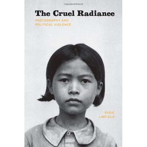
Reading: The Crual Radiance by Susie Linfield

This was not an easy nor a comfortable read, but a very thought provoking one.  In this book Susie Linfield takes on the throny subject of photography and political violence.  She starts with a chapter that tries to answer the many comments by photographic theorists such as Barth and Sontag, as well as many others.  The basic, and it almost seems accepted, thesis is that photographs contain no truth and the only meaning they carry is that which the reader imparts to them.  She disputes this and very clearly states that there is much to learn from photographs and that they provide an excellenet evidentiary source, however, on that needs context, it is Photography + Words that produces meaning and context.  The book is worth buying for this alone, this is the first author I have read to stand up to the post modernist view of photography.

However, the central question posed by the book is whether there is value in photographs of suffering and how or even if we should look at them.  She discusses the photography of a number of major horrors the world has suffered, the Nazi Holocaust, The Chinese Cultural Revolution, Post War Central African Conflict, and the combination of Abu Graib and Terrorism.  In each case she analyzes the politics, the cultural impact and the way in which photography has served both as witness but also as a means for survivors to deal with the terror they endure.  She has a clear political stance but reading this book I did not feel dictated to, rather that I could make up my own mind on these subjects.
A key difficulty in the photography of violence it that the pictures are frequently created and collected by those responsible for the violence, victims rarely have the chance to document their own pain.  These images, such as those taken by Nazi soldiers in the Warsaw Ghetto pose the most difficult question in how we should look.  These are images taken of humiliation, the subjects humanity is further eroded by the act of photography and yet these images are sometimes the only remaining document of these peoples existance and are damning evidence of the cruelty inflicted.  My conclusion is that we should look at these pictures, but again with context and an understanding of how and why they were made.  I find it important to know that the photographer was complicit in the abuse and not merely a witness.
She finishes by looking at the career of three famous conflict photographers, contrasting their styles and trying to understand their motivation.  The photographers are Robert Capa, James Nachtwey, and Gilless Peress, 3 very different, but influential artists.  In analyzing each photographers work the most interesting discussion is around style and presentation, Capa seems very natural not attempting any sophisticated framing, simply reportage, whilst Nachtwey is seen as making the obscene attractive, applying art to pain.  Perhaps this is why he refused to allow his photographs to be reproduced in this book.  The authors opinion seems to be that capturing and revealing pain and suffering at the hands of others is a socially important act, however, portaying it as art is not.
I think this comes back to the long lasting debate about photography frequently being the study of those without by those with.  My final comment about the book is that it is very light on illustration, there are  1 or 2 images per chapter, but no more.  In the text she repeatedly refers to images that are not in the book.  Perhaps this is a good thing, these are not easy photographs to look at for all of their importance as document. The picture on the cover is of a 7 year old girl photographed shortly before her "execution" by the Khmer Rouge in Cambodia, her crime simply being.  One can only look at so many photographs like this.

Sunday, April 3, 2011

Ex. 23 Alteration

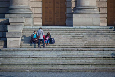
The final exercise in this project is by the far the hardest, and the least satisfactory from an ethical standpoint. However, it was an interesting activity and a serious test of patience and perseverance.  My selected image is a shot that was under consideration for my assignment 4, but was rejected as I felt there were too many people in the frame:


First task was the easiest using the clone stamp tool to remove the beer bottle in the upper left of the frame.  For this exercise I have only used the clone stamp tool, varying the brush size and hardness to each of the removal challenges:


Next I removed the man leaning up against the wall, pretty simple this one


Next was the couple at the front, a little harder, but no major problem:


The large group of girls on the right hand side was much harder as I had to clone from both sides, due to the size of the group.  An issue that came up here was that the steps are not completely parallel to each other, so I had to be careful with each selection:


Next to go and by far the hardest to deal with was the two guys at the top.  The area they are sititng in has no clear replica in the frame, so I had to effectively paint in new structure, but still using the clone tool.  Looking carefully there are obvious artifacts, but you would need to know to look and even then at a pixel level.


The last group was easier and by now I was building skill and confidence


Final task was removal of a few shadows and intrusions into the frame on the right hand side.


Would have taken less time to go back and re-shoot the image, but again, a valuable learning experience.

This example represents no ethical issues, but similar techniques used on an image presented as news would be pretty much fraud.

Ex. 22 Addition

With this exercise, I move beyond the point at which I am comfortable making changes to photographs.  Whilst I have tried in the past to make HDR comps I have never really liked the final result, frequently such photographs look highly "manufactured".  I would prefer to get it right in the camera, using filters if need be.

After two weeks of completely Blue skies I finally saw a cloud a few days ago and rushed to fetch camera and tripod.  Unfortunately this was still far from ideal as the sun was in the direction of the clouds, however I set up on a busy city junction where I could get a good uncluttered sky line.  I took a series of 7 shots separated by 1 stop each, the two I have selected for this exercise were as suggested 2 stops apart


In lightroom I have adjusted the levels on the second image and ensured that they both are using the same white balance setting.  In Photoshop I selected and deleted the sky:


I then added the former image as a separate layer directly beneath the latter:


I have tried to work the image to create a more natural look, but this still looks wrong to me, perhaps my lack of technique or simply two images meshed together is false.  Alternatively I worked on the image in Lightroom some more and produced the following, which is better than the merge although the colour in the top left is degrading.  Overall perhaps a better photographic choice to start might have been better, however, the climate is not kind at present.


I have then used the original masked image and loaded 4 different skies as layers:


Two of these are clearly fake and a little fun for me, although the Volcanoe is quite fun, even if the sun is completely in the wrong place.  The first is a tropical sky, the 4th a Munich sky. both look added, although not completely false.

My take on all of this remains that I have now stepped across the Rubicon and am making changes that fall outside my comfort zone, into areas that I feel risk undermining the credibility of photography.