Up until now I have simply used white balance to try and improve the colour balance, something that works most of the time, but clearly not all of it. Colour cast is a major issue in my underwater photography and I have spent much time with an eye dropper or directly manipulating the white balance to try and eliminate it. Truth is some colour problems simply cannot be fixed using White Balance alone.
I have divided this exercise into two parts, first off I want to attempt to improve the colour balance of some of my favorite underwater images. To achieve this I have done all processing in Lightroom, exporting to JPG at the end. For each set of images I have provided first the "RAW" image as taken, then the processing I did originally (and was happy with) and finally a new version taking advantage of selective colour management using the HSL tools in Lightroom. These permit individual adjustments to 8 colours, Red, Orange, Yellow, Green, Aqua, Blue, Purple, and Magenta. The adjustments are Hue, allowing each colour to be shifted towards the colours either side of it, Saturation, and Luminance. In the past I have been almost afraid of using these tools, but WOW, what a difference they can make to underwater images.
My first image is a shot of a turtle taken from vertically above it looking down the side of a reef. This photograph preserves the colours reasonably well as I used a red filter on the lens to re-balance the attenuation of red light in water. In each of the 3 images from underwater the RAW image is quite dull, that is normal unless you are very close to the subject, not always possible:
The initial unprocessed shot is dull, but applying white balance from the turtles shell and then bumping up the contrast produced a satisfying image, but one in which the background is a greeny blue, a common issue and effectively the mixture of blue water and white sand. By selectively desaturating Aqua and decreasing the Blue luminance, I have shifted the background towards Blue and created something far closer to the way the reef edge really looks.
In the next sequence, once again I am using a red filter, but this time shooting along the reef. White balance came from the silvery sides of the Baracuda, but again resulted in a blue-greem background that I have now learned how to shift to Blue.
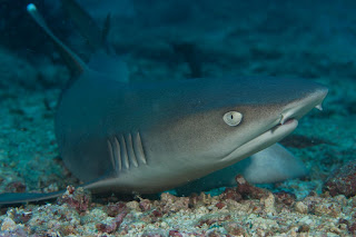
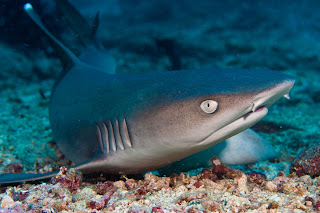
My third and final image is a close up of a White Tip reef shark taken from about 30cm away. he is just turning to flee as I finally get too close for comfort. As an aside this is one of my favorite shots, combining movement with eye contact and taken in a place I truly love. On the edge of the island of Sipadan in North East Borneo is a small underwater gully full of coral rubble on which the sharks rest. I literally sink to the bottom and crawl on my elbows towards the sharks seeing how close I can get before they scoot. Great fun. This is also an image with an easy White Balance, the shark is grey. However, that still leaves the unpleasant blue green cast of the background
This one was harder to do and the shark now has a slightly blue tint, but I think that is better than the green tint of the previous conversion.
Above water, similar problems exist, as this shot of a fisherman in North Sulawesi, Indonesia shows
The starting shot was very grey, it was a hazy day, however, processing pushed it into the blue greens again. With the second attempt I have reduced that somewhat, but also changed the colour a little on the canoe and cropped some of the foreground away. This was an image for my TAOP Assignment 5, so good to take a new look.
My final image is also from TAOP, this time Assignment 3. Once again my initial processing has led to a greeny blue in the sky, however, correcting this was very complex:
In the middle image, even the shadow is a blue-green. To correct this not only needed careful adjustment of the Blue and Aqua, but also adjustment to the yellow lights. I still feel that the sky could be a darker blue, maybe I should have added a darkening gradient to the top of the photograph.
Here is the Lightroom Development tool bar as used for this adjustment:
I have been fiddling with this tool set all week and really feel empowered after figuring out the utility of the HSL corrections. My next underwater images will really benefit from this exercise.


No comments:
Post a Comment